My Last Blog

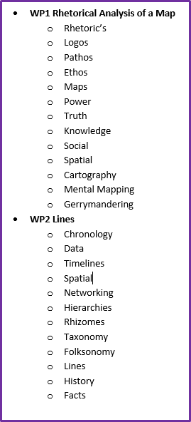
During the Winter semester in 2019, I studied maps, infographics, lines, and numbers in depth for my English 212 class. Previously to taking this course, I never knew that there was so much knowledge and information behind each of these concepts. I discovered the importance of using composition skills and rhetoric through these types of interfaces and data. Accomplished writers will use several types of rhetorical devices in their work, in order to communicate the right message to their audience. When using rhetoric correctly, it’s about carefully choosing the right approach to communication. This can include visual, verbal, word-based, and auditory. Writers will often apply the rhetorical appeals ethos, pathos, and logos to their works as well. This is why rhetoric matters because creating the perfect image, with just the right amount of supporting data, creators can change their audience’s opinions or perspectives. This can be applied to any creation that authors come up with not just maps, lines, and numbers.

            With that being said, much of this content that I’ve learned over the past several months has changed my attitude towards writing. Every time I take an English class I go into it thinking, how could there possibly be anything else to learn about reading and writing? But, this class has proved me to be very wrong. I have a much higher respect towards writers and content creators. The research that I’ve completed about maps and lines and how much everything changes over time revealed to me that there is so much more to writing than just thoughts jotted down onto paper. It has widened my definition of the word “text.” Why? Well, writing has the potential to contain so much more then someone might think. Every writer has a purpose to the content that they choose to include in their work and sometimes it takes more than just simply reading the text to be able to understand and take away from what they have put together for their audience.

            My relationship with writing has always been a love-hate relationship. The reason that I say this is because the idea of writing a paper makes me anxious. I always like my writing to be flawless and that means many, many hours of writing and re-writing. So, I get nervous of the thought that I might have to spend hours of my weekend writing a paper, but I still do enjoy writing. I also think that as a result of the extra time and effort that I put into my writing has helped me to develop into a very good writer.

            Overall, my writing tactics have not changed very much at all, but I do have a better understanding of how rhetorical and analytical writing is supposed to be done. I appreciate that I was able to learn more about the history of maps and timelines because as I stated before, I had no idea how complex these concepts were until I was given the opportunity to learn more about them. When I’m reading and writing visual text versus traditional text, I’ve gained a deeper understanding of the purpose and intention that authors put behind their work.

            Now that the semester has come to an end I will no longer be writing to this blog. Though I have never taken an interest in keeping a blog, it was still eye-opening to see how myself and others create them. But I am glad I was able to express some of my thoughts about maps, infographics, lines, and numbers through my blog this semester.

Thanks!

Kailey

My Response to Feminist Data Visualization

After reading D’Ignazio’s, “What would feminist data visualization look like?”, I was able to identify some of the important people and key terms located throughout the article. These include:

  • Michael DeCerteau “totalizing eye” (to see and understand something completely).
  • Donna Haraway “tour-de-force” (an achievement that has been accomplished with great skill). “the God trick” (a type of illusion).
  • Denis Wood and John Krygier “symbolization” (using an image, shape, or color to represent or communicate something). “generalization” (taking something specific and applying it more broadly). “classification” (arranging something according to specific qualities or characteristics).
  • Andy Kirk
  • Gwendolyn Warren “Black planning” (empowers black citizens to make decisions for their communities).
  • Brooke Singer “talking back” (allows for society to give their opinions and add their own input on certain situations).

I also found some significant information throughout the article in regards to what I’ve already learned throughout my English 212 class this semester. These include:

  • “Data visualizations wield a tremendous amount of rhetorical power.”
  • People accept charts as facts because: generalized, scientific, experts, neutral point of view.
  • “All knowledge is socially situated.”
  • Maps=sites of power.
  • Facts are not always what they appear to be.

The author’s thesis/purpose of her article is: “Until we acknowledge and recognize that power of inclusion and exclusion, and develop some visual language for it, we must acknowledge data visualization as one more powerful and flawed tool of oppression.” Some of her proposed solutions for the issues within her article include:

  • Digging into data provenance.
  • Collecting missing data and finding out who’s responsible.
  • Collect more metadata and prioritize its visual display.
  • Show not just “what the data says” but to show how the data connects to real body systems, and structures of power in the wider world.
  • Make dissent possible.
  • Present alternative views.
  • Talking back to the data.

If I had to ask a question about this article I would ask:

“How would data visualization change if it really did become more feminine? Is it really that important?”

The part of her text that I agree with is when she writes “most people working in data are white guys” and how she goes on to say that people of all walks of life should be more included in order to present alternative views. She talks about how visual strategy  could improve if dissent were to become possible. We have talked about the use of visual strategy throughout my English 212 class and how the difference between successful and non-successful creators is the strategies they use when incorporating their data inside charts and diagrams.

To summarize D’Ignazio’s article, “What would feminist data visualization look like?” she starts with talking about the rhetorical power that data visualization holds but how they’re missing information and they “don’t represent the whole world.” She says people have a hard time accepting charts as facts because the information is generalized, scientific, given by experts, and holds a neutral point of view. She states the many underlying issues that are found throughout data visualization and that maps are a “flawed tool of oppression.” She poses the question, “how to we represent the data that’s missing? and “who made it all happen?” Towards the end of her article she mentions dissent and what the advantages would be if dissent was made possible. “Most people working in data are white guys.” She says if we work on including different people and perspectives then visual strategies would improve. Overall her views of including more diversity like women and people of color, then data would become more responsible and it would be easier for the gaps within the data to be filled.

I think this article is very helpful in understanding the issues within data visualization. The article was easy to relate to the information that I have already been studying throughout the last few weeks like the power of rhetoric’s, the use of visual strategies, the people who are responsible, and the ways that data is incorporated into charts and maps.

Visualizing Data: News Article vs. Infographic

Hi, today I read an interesting news article about the amount of minimum wage increasing in the state on Michigan on March 29, 2019. You can find the article by going to this link:

https://www.mlive.com/news/2019/03/michigans-minimum-wage-goes-up-on-march-29.html

After reading this article I created an infographic to sum up the data/important information that was given to its readers throughout. My objective with this project was to create a visually pleasing image with the information throughout the news article, to create a better reading experience for viewers. First to visualize my data, I created a list of important points which made it easier for me to translate the information from the article. Here is the list that I came up with:

  • Minimum wage Increase
  • People who are affected
  • Dates of occurrence
  • Amounts for the different types of minimum wage

Next, I chose a format for my infographic that I thought would work best for presenting this data. Then, I referred back to the article for specific numbers. This helped me throughout my creativity process when I looked back at the original article and made it easier for me to come up with ideas that best fit my specific graph. Finally to tie everything together, I found symbols and inserted just the right amount of text. Here is the infographic that I created:

https://create.piktochart.com/output/37673211-kailey-scott-s-infographic

I find it much more effective to read data off of an infographic in comparison to the news article. It grabs my attention and I think it makes the information more interesting to look at and read when there are symbols and pictures that sum up the data for you. I think the visuals within the image that I created act in a persuasive way because it catches a persons eye and it contains a lot less words.

Taxonomy Versus Folksonomy

Hi! Recently, I created a taxonomy and a folksonomy for my English 212 class. For starters I’m going to define each of these terms. A taxonomy is simply a classification of something. A folksonomy is a classification system derived from user generated keywords. So, these terms have a pretty similar definition, but the following attached images will help to gain a better understanding of what I’m talking about.


As you can see, for my taxonomy I established an outline of different topics and terms that I’ve used throughout my English 212 class. I used the two most important topics that we have talked about thus far and then included some of the other terms that we have explored throughout those topics to create this outline. For the folksonomy I created a wordcloud. To create my wordcloud, I copied all the words from my taxonomy/outline and put them into a huge jumbled up cloud of words. It was interesting to see how the colors were used and which words were emphasized more. The worldcloud’s purpose is to open the eyes of the reader.

During this English course I’ve observed that we are really focusing on analyzing maps and lines and finding a deeper meaning for them. After comparing both my taxonomy and folksonomy’s, side-by-side I detected that my observation very much reflected what my wordcloud generated. The wordcloud chose to make terms like maps, lines, and the rhetorical appeals to appear bigger. All of this information makes sense considering the course is about Maps, Lines, and Numbers.

In my opinion, I like the taxonomy better because it is in the form of a list. I prefer a list over a wordcloud because it is easier for me to visualize what I’m working with. This way I can feel more organized and keep all the same thoughts under the correct categories. Although I like lists better I did really like how my folksonomy turned out. I also found it to be very helpful because of the way it broke the words into different areas. Overall, I enjoyed reflecting on the differences between a taxonomy (my outline), and a folksonomy (my wordcloud).

The Power of Maps

Hi, it’s Kailey. I used Saginaw Valley State University’s campus map and created my own version for a specific group of people to utilize. Comparing these maps really shows how powerful perception actually is when it comes to different audiences who view the same exact thing.

Here is a picture of SVSU’s current campus map:

And here is the map the I re-created:

This map allows for a less complicated look at Saginaw Valley State University’s Campus. The purpose of this is give new-comers, visitors, and even returning students a less crowded view and more straight to the point illustration. Although this map could potentially be used by anyone, I think its main audience is for prospective students who want to visit the campus for a day. This “less complicated” look provides people with just enough information to give them a good look at the size of SVSU’s campus, areas for sports and recreation, the multiple buildings used for educational purposes, and much more.

                I used the rhetorical appeal ethos and persuaded my audience that this map is a better choice. I did this by re-arranging the original map using darker colors, full words in place of abbreviations, took away extra clutter like symbols and numbers, and made sure to use fewer colors to group areas into broader categories.

I recreated this SVSU map because when I was new to SVSU’s campus I got very overwhelmed when I took a look at their map. As a freshman, I had no idea where I was going when it came to finding my classes. In my opinion, SVSU’s map is great for students who know their way around because it goes into detail where to find almost anything on campus, but I think it would be a lot easier to read with less clutter. I hope that those who view this map, find it easier and less confusing to look at. That is why I created this map.

Map Rhetoric and Threshold Concepts

Hi, Kailey here. Based off of the title of my English 212, “Writing with Maps, Lines and Numbers,” class I’m assuming that I will make connections from my everyday life to this specific class through watching movies, things I learn in my current 204 English class, as well as new terms and styles of writing that I can use on a daily basis. I hope that blogging my thoughts and ideas makes it easier to keep track of my responsibilities. I also hope to gain a better understanding on why people like to blog in the first place and learn more about its purpose.

A concept from AdlerKasner and Wardle’s text, “Threshold Concepts of Writing,” that I found interesting is that “Writing Expresses and Shares Meaning to be Reconstructed by the Reader.” In my opinion, this concept is about expression. Writers use personal experience in their writing to put forth a message that’s meaningful. This allows the reader to relate easier. I found in the text that they also mention writing being tricky sometimes because writers are not always 100% sure that what they write is going to appeal to the person who is reading it. Not a single person will have the same thoughts and opinions on a single piece of writing.

 In my opinion this threshold concept of writing and text can relate to a map very well. (See attached picture) Why a map? Well maps are well thought out and are used to put forth a clear message to readers. If a map is not drawn to scale or the data on it is incorrect, it can really mess with how the reader translates the map itself. Although some writers can warp the truth and make it seem logical and like it makes sense to the eye, even if it’s not the entire truth. Maps can help people with directions and research. It can complicate things if what is pictured is incorrect or hard to read for many obvious reasons.

The rhetorical appeal ethos stems from the person who creates the map. The ethics and beliefs of authors all around can vary greatly. They have the power to manipulate the content that they’re creating. This could possibly lead their readers to believe certain things. But the direction of their manipulation depends on the their ethics and how they view it. The rhetorical appeal, pathos can also apply to this situation. Those who are reading the map, can represent one thing but can also be viewed in a totally different way. That’s just like what happened in the “West Wing” video clip and the article “How map projections warp your understanding of geometry.” Even though the maps/pictures were the same, the people looking at them were viewing them from 2 different perspectives.

 I chose my own map to talk about. This map reflects the threshold concept that I selected because of the many ways it could be perceived by others. The creator of this map has reasons as to why they used the sizes, colors, data, and information for this particular map. The creator of this map is clearly trying to use these traits to represent the varying sizes of the continents. But I also noticed that not one color is touching its own kind. In my opinion, the creator of this map did this to make it easier for their viewers to read. In conclusion, writers do everything they create and write for a reason and that is very much proven in the map that I chose.